What Do the Colors of Your Brand Say About Your Business?
Think of Coca-Cola, Facebook, McDonald’s. You probably remember their colors before anything else. It’s no coincidence. Colors impact how people perceive a brand and how consumers connect with it.
At Talko, we know that choosing the right color palette for your brand can make the difference between connecting with your audience or getting lost in a sea of competition. We’ll explain what each color conveys, examples of sectors that use them, and how to create a coherent visual identity.
The Psychology of Color in Branding: What Does Your Brand Convey?
Red: Passion and Urgency
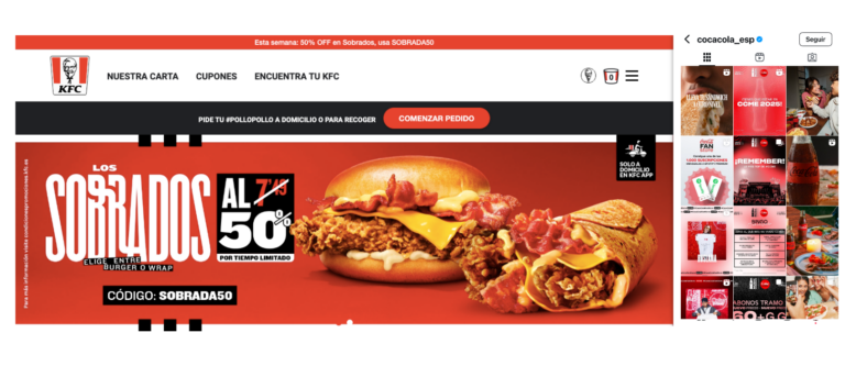
Everything to red! Energy, passion, and action are what come to mind when we see the color red. Brands like Coca-Cola and YouTube use it because it generates intense emotions and stimulates action. It’s also associated with hunger, which is why fast-food chains like KFC and Burger King choose it.
Perfect for brands that aim to provoke strong emotions and generate a quick response from the consumer.
Yellow: Optimism and Happiness
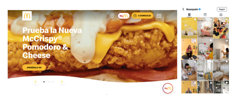
Yellow is the color of the sun, creativity, and positive energy. Brands like McDonald’s and IKEA use it to convey a sense of happiness and warmth, but be careful! Too much can become overwhelming.
Ideal for youthful, innovative brands that want to radiate optimism.
Blue: Trust and Professionalism
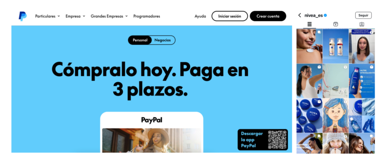
The color of calm, security, and trust. It’s widely used by tech and financial brands like Facebook, LinkedIn, or PayPal because it generates reliability. The healthcare sector also uses it because it conveys calm and reduces patient anxiety.
If you want to project seriousness and trust, blue is your best ally.
Green: Nature and Growth
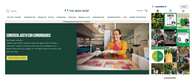
Green is associated with nature, health, and growth. It’s the favorite color of eco-friendly and wellness brands like Starbucks and The Body Shop. It also conveys balance and harmony, making it a great choice for businesses in healthy food, pharmacies, and sustainability.
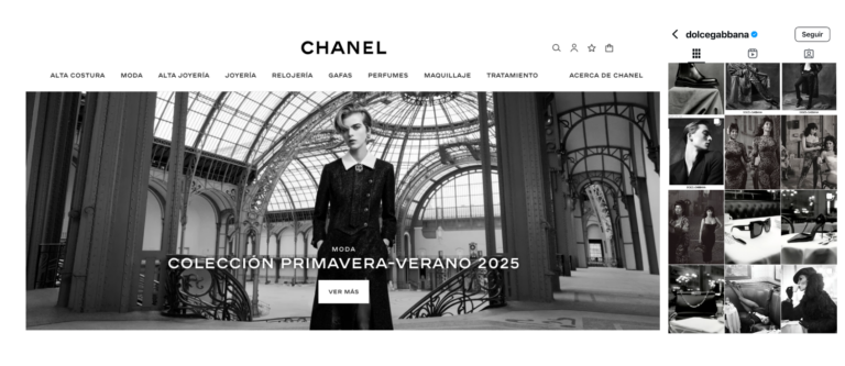
Black: Elegance and Sophistication
A symbol of luxury, exclusivity, and authority. Black is used by high-end brands like Chanel and Boss to project power and minimalism. It’s also common in technology and automotive, such as Apple or Mercedes-Benz, to reflect sophistication and premium quality.
Purple: Creativity and Spirituality
Purple is linked with creativity, sophistication, and spirituality. It’s a widely used color in the psychology sector because it is associated with the mind and introspection. Companies like Hallmark or Yahoo! use it to project originality and a unique touch. Additionally, purple is also used as a symbol of feminism, adopted by organizations, feminists, and NGOs promoting gender equality and raising awareness about women’s rights.
Perfect for wellness, spirituality, psychology, artistic sectors, and initiatives advocating for gender equity and female empowerment. The screenshot shows the profile of @_fisuras, our favorite journalist and feminist educator.
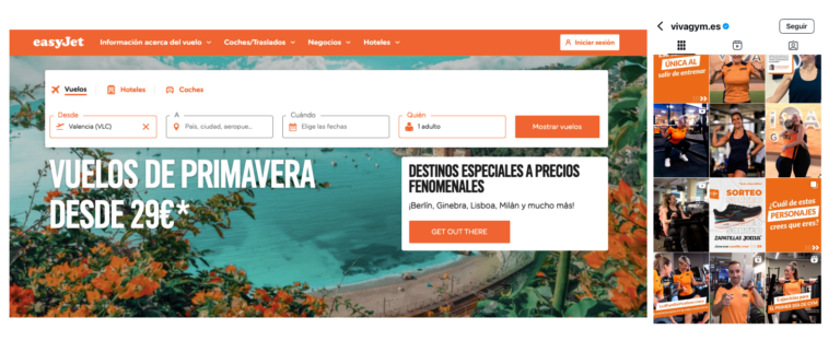
Orange: Energy and Dynamism
A vibrant color that conveys enthusiasm and action. It’s favored by gyms like Basic-Fit and Viva Gym because it motivates physical activity. It’s also used by youth-oriented brands and food companies, such as Fanta, because it evokes fun and freshness.
Recommended for businesses that want dynamism, activity, and closeness.
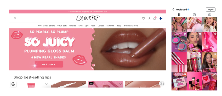
Pink: Femininity, Sweetness, and Solidarity
Pink is strongly associated with femininity, tenderness, and softness. It’s widely used in beauty and cosmetics brands like Glossier and Too Faced, aiming to convey elegance and personal care. It is also used in breast cancer awareness campaigns, becoming a symbol of solidarity and support for the cause. Many brands aiming to connect with a youthful and dynamic audience, such as Barbie or Victoria’s Secret, use it to reflect fun and glamour.
Perfect for fashion, beauty, wellness brands, and social campaigns.
Beige and Neutral Tones: Balance and Serenity
Neutral colors like beige, white, and gray convey calm and elegance without distractions. They’re ideal for design, decoration, fashion, and wellness brands. Companies like Zara or Estée Lauder use them for a minimalist and timeless style.
At our marketing agency, we choose a combination of neutral colors like beige because they convey calm and elegance. We also incorporate black, representing technology and sophistication. We opt for neutral tones because they make it easier to present and harmonize our portfolio, which is essential when working with clients from diverse sectors. We also wanted every potential client to feel identified with our brand.
How to Choose the Ideal Color for Your Brand?
Now that you know what each color conveys, we can choose the one that best represents your business. Consider:
- Your target audience: It’s different to target young tech enthusiasts than a corporate audience.
- The message you want to convey: Think about the feeling you want to provoke in your customers.
- The sector you operate in: Some industries have predominant colors. For example, gyms use bold colors, while healthcare uses calm tones.
- Consistency with your visual identity: Your website, physical location, and social media should reflect the same palette to create a homogeneous and recognizable image.
- Color combination: You don’t have to stick to just one color. Many brands combine several tones to create a more complex and nuanced visual identity. For example, Instagram uses a gradient of purple, pink, and orange to convey creativity and modernity.
Not just one color, you need strategy.
At Talko, as experts in social media and branding, we not only help you choose the right colors for your business, but we also design a complete visual strategy to make your brand stand out in an increasingly competitive market.
Do you feel your brand’s colors don’t truly represent your business?
Contact us, and we’ll help you create a visual identity that connects with your audience and enhances your brand!